BBB Korea Volunteer Interpretation App Redesign
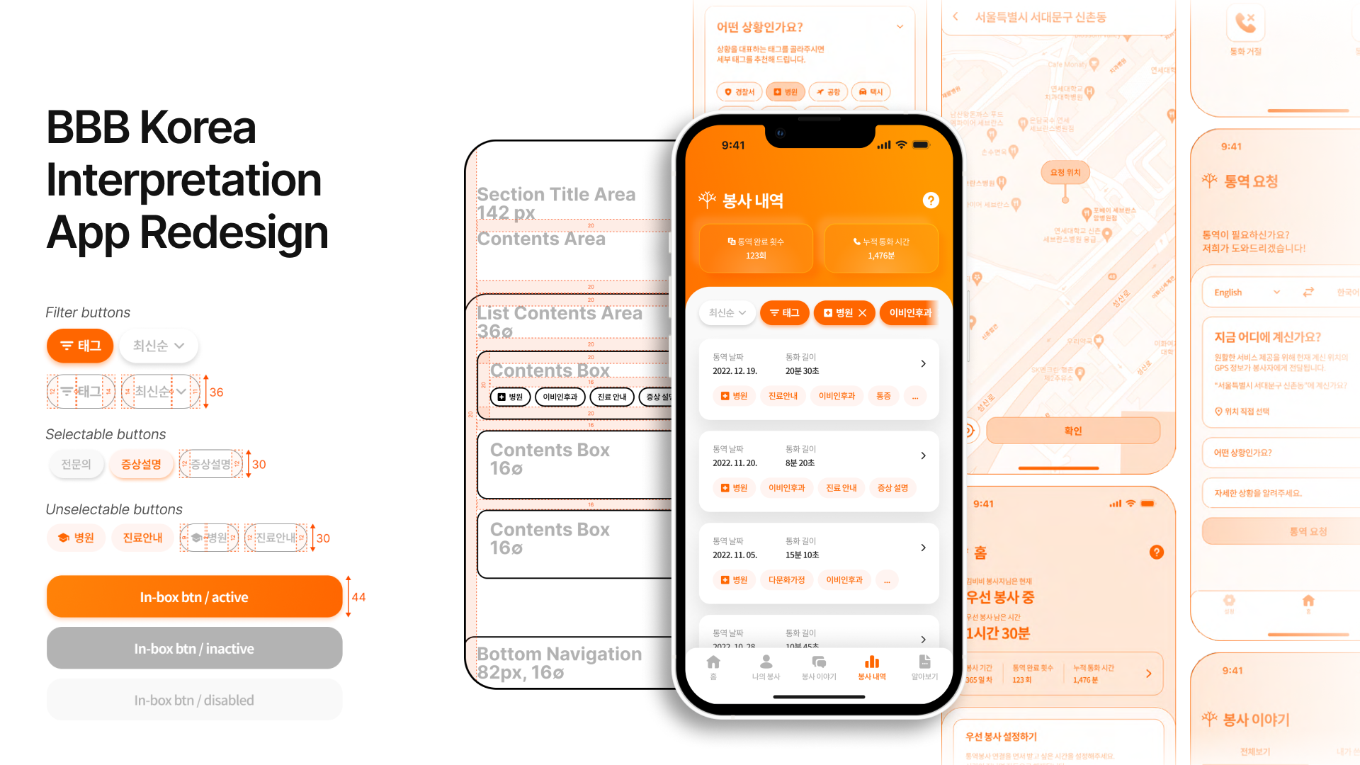
1 Overview
- We redesigned the apps for BBB Korea’s volunteer telephone interpreting service, covering both people requesting interpretation and the volunteers who provide it. Across iOS and Android, we reworked the information architecture and interactions to make key features easier to reach and the experience more consistent.
- We reviewed requirements, evaluated usability, and studied patterns in other services before rebuilding the wireframes and developing the detailed UI. The final designs were implemented in the live service.
- My role: I joined the project as a member of UNIST EXPC Lab and was responsible for the UI/UX design of the iOS volunteer app.
2 Context
BBB Korea is a nonprofit that provides telephone interpretation between Korean and more than 20 other languages. Volunteers handle 60,000–70,000 interpretation requests or more each year. The service brings together people who need interpretation, volunteer interpreters, and the staff who manage its operations.
At the time, BBB Korea was exploring how speech-to-text (STT) could be applied to speech data from interpretation calls, including analyzing their content as part of a broader shift toward digital services.
To bring these changes into everyday use, the mobile apps used by both callers and volunteers needed attention first. Features were scattered across multiple screens, and the existing structure made the apps difficult to navigate and use consistently.
We wanted to improve the whole experience of requesting and providing interpretation. This meant rethinking the apps’ structure and interactions alongside their visual design.
3 Approach
3-1 Reviewing Requirements and Usability
We began by collecting screenshots of every screen in both apps and mapping the navigation paths and screen transitions.
Using Hick’s Law, Jakob’s Law, Miller’s Law, and Nielsen’s 10 Usability Heuristics as reference points, we reviewed the amount of information on each screen, interaction patterns, status feedback, and error prevention.
Three main issues emerged:
- Key features took too many steps to reach. In the volunteer app, setting availability required up to three or four screen transitions. In the user app, language settings were spread across several locations, creating room for confusion before someone could request interpretation.
- Icons and labels were inconsistent. The same feature sometimes appeared under different names, while other labels gave little indication of what a feature did.
- Actions lacked clear feedback. After changing a setting or using a feature, users could not easily confirm the current status or the result of their action.
We also identified smaller improvements on individual screens: login assistance, password visibility, placeholder text, consistent feature names, required-field indicators, dropdown controls, clearer labels for statistics, and contact search.
These findings became the criteria for the design work that followed.
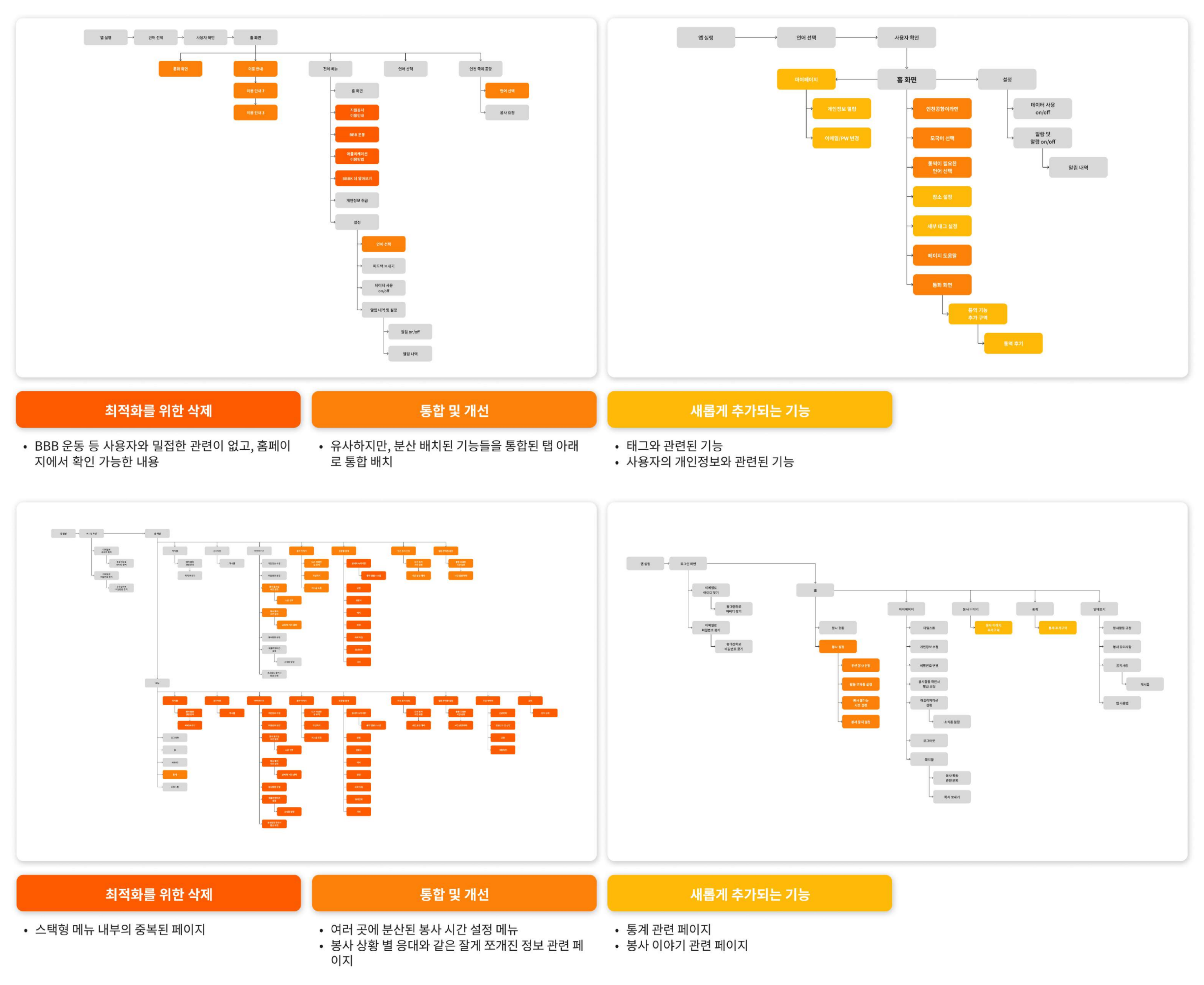 Screen flows in the original user app (top) and volunteer app (bottom), showing long navigation paths and duplicated structures.
3-2 Learning from UI/UX Patterns in Other Services
To find useful ways to address these issues, we looked at services with similar interaction needs.
We studied financial apps where quick access matters, such as Toss and KakaoBank; platforms used across age groups, including Naver, Kakao, and Google; and Reddit’s use of tags to explore content. We compared menu structures, the size and placement of interface elements, interactions, and ways of presenting information to identify patterns we could adapt for BBB Korea.
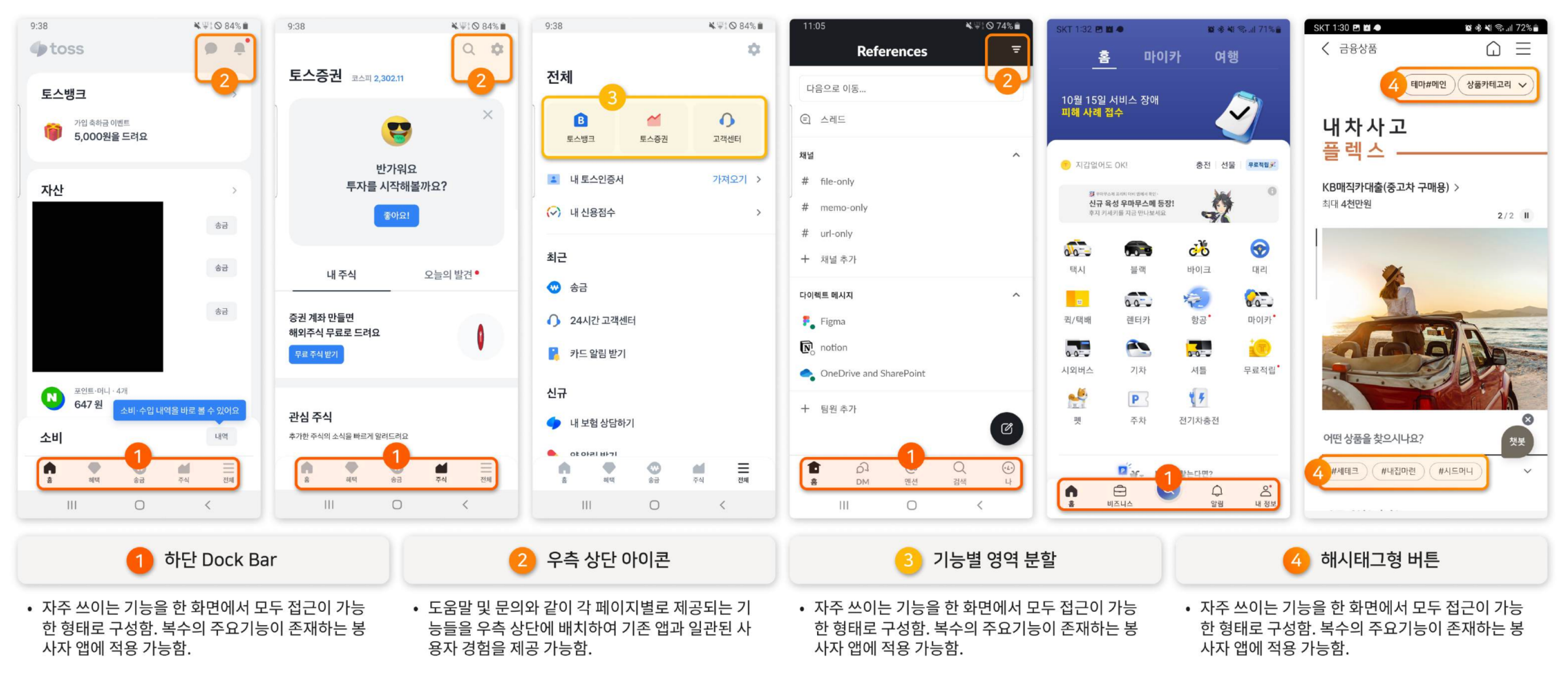 Benchmarking financial apps and apps for a broad age range, with a focus on menus that give quick access to key features.
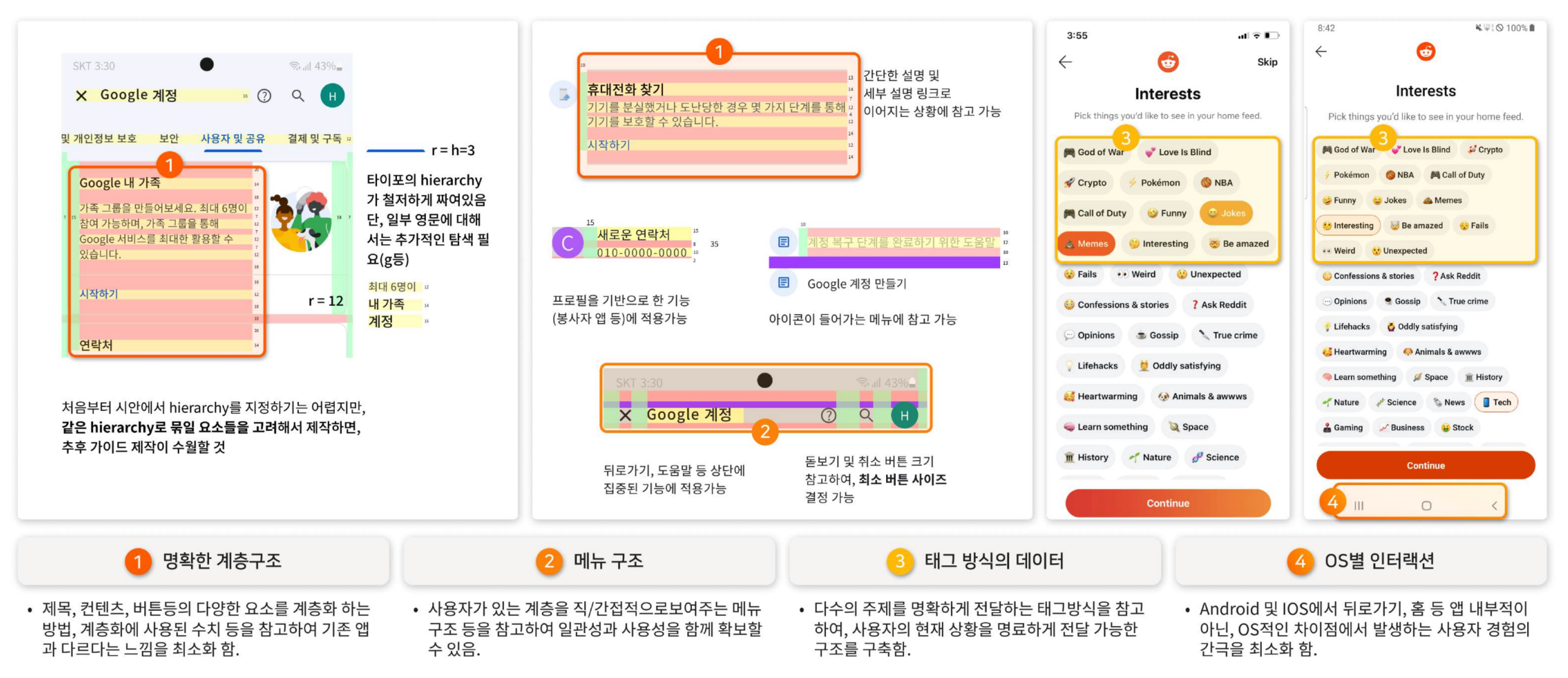 Benchmarking Google and Reddit: content layout, use of whitespace, and tag-based navigation.
Two directions stood out:
- Use bottom navigation to bring key features within reach. The hamburger menu gathered features in one place, but users still had to search through it to find what they used most. We explored placing key features in bottom navigation and giving important actions, such as requesting interpretation, greater prominence.
- Simplify frequent actions with floating action buttons and grouped controls. Volunteers needed to change their availability and activity status without moving through several menus. We looked at floating action buttons (FABs) and ways to group related controls to shorten these paths.
We also compared iOS and Android design guidelines for tabs, back navigation, and typography, establishing interaction conventions appropriate to each platform.
3-3 Reworking Wireframes and Reorganizing Features
We rebuilt the wireframes for both apps around two principles drawn from the review and benchmarking:
- Make frequently used features accessible from the home screen in as few taps as possible.
- Bring related features together to reduce the number of screens and navigation steps.
User App
We simplified the screen structure around the task of requesting interpretation.
Some features with little relevance to users were removed, and related features were brought together under shared tabs. The steps needed to set a native language and access help dropped from up to three taps to one.
Volunteer App
We reorganized the app so volunteers could check and change their status more quickly.
Availability and absence settings, previously spread across three locations, were brought together on the home screen. We also shortened the steps for changing status and adjusting time settings. Across core tasks, this reduced the number of taps by an average of one to two.
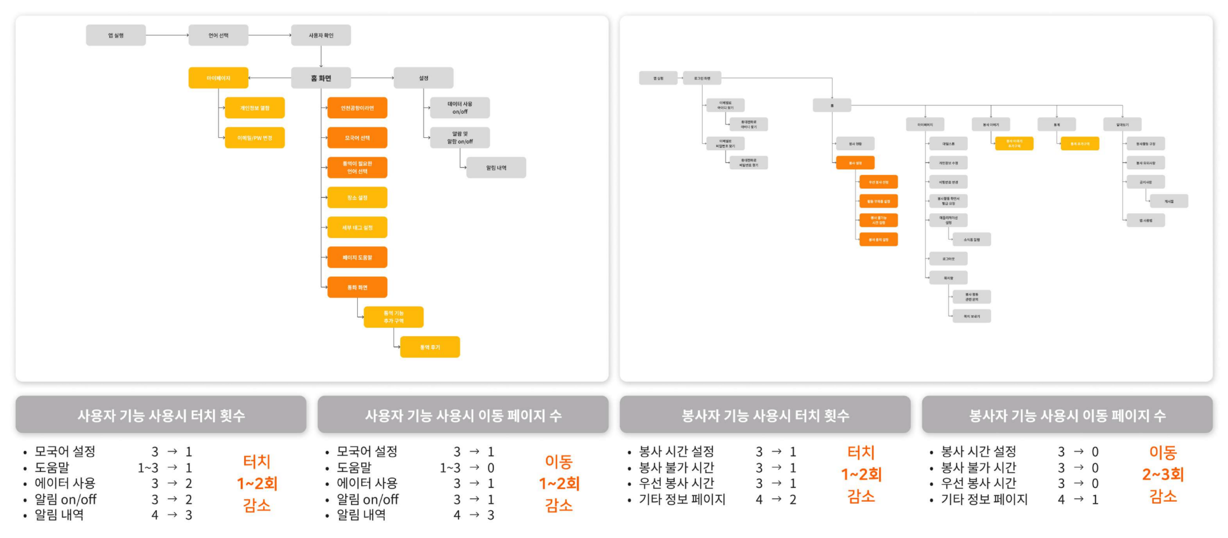 User app (left): language selection and interpretation requests reorganized around the home screen. Volunteer app (right): settings previously spread across several menus brought together in the home screen’s tabs.
4 Outcome
Using the revised wireframes, we designed the detailed UI for both the user and volunteer apps on iOS and Android.
Four priorities shaped the final designs:
- Platform conventions: Follow familiar iOS and Android patterns while keeping a shared brand identity.
- Consistency across apps: Use a common visual language and consistent interactions in the user and volunteer apps.
- Visual refinement: Refine the interface with reference to design trends at the time, including neumorphism.
- Room for new features: Integrate additions, such as tags linked to STT, into existing user flows.
We designed the screens and detailed interactions, including scrolling and dropdowns, in Figma. Through Zeplin, we shared specifications such as font sizes, spacing, and color codes with the development team.
The final designs were implemented in both apps on both operating systems.
User App
The redesigned screens help users set up an interpretation request more quickly and clearly, and explain the situation they need help with.
The splash screen uses images of people of different genders and ethnicities to express BBB Korea’s vision of communication without language or cultural barriers.
On the request screen, users can select the source and target languages directly. Location selection uses a map and search, while a searchable language list leaves room for more supported languages in the future.
We introduced tags to help users describe their situation with just a few selections. Separating “context tags” from “detail tags” lets users give a brief outline of what they need.
The existing “Incheon Airport” feature was expanded into “Quick Interpretation.” By removing the restriction to a single location, we redesigned it for a wider range of urgent interpretation needs.
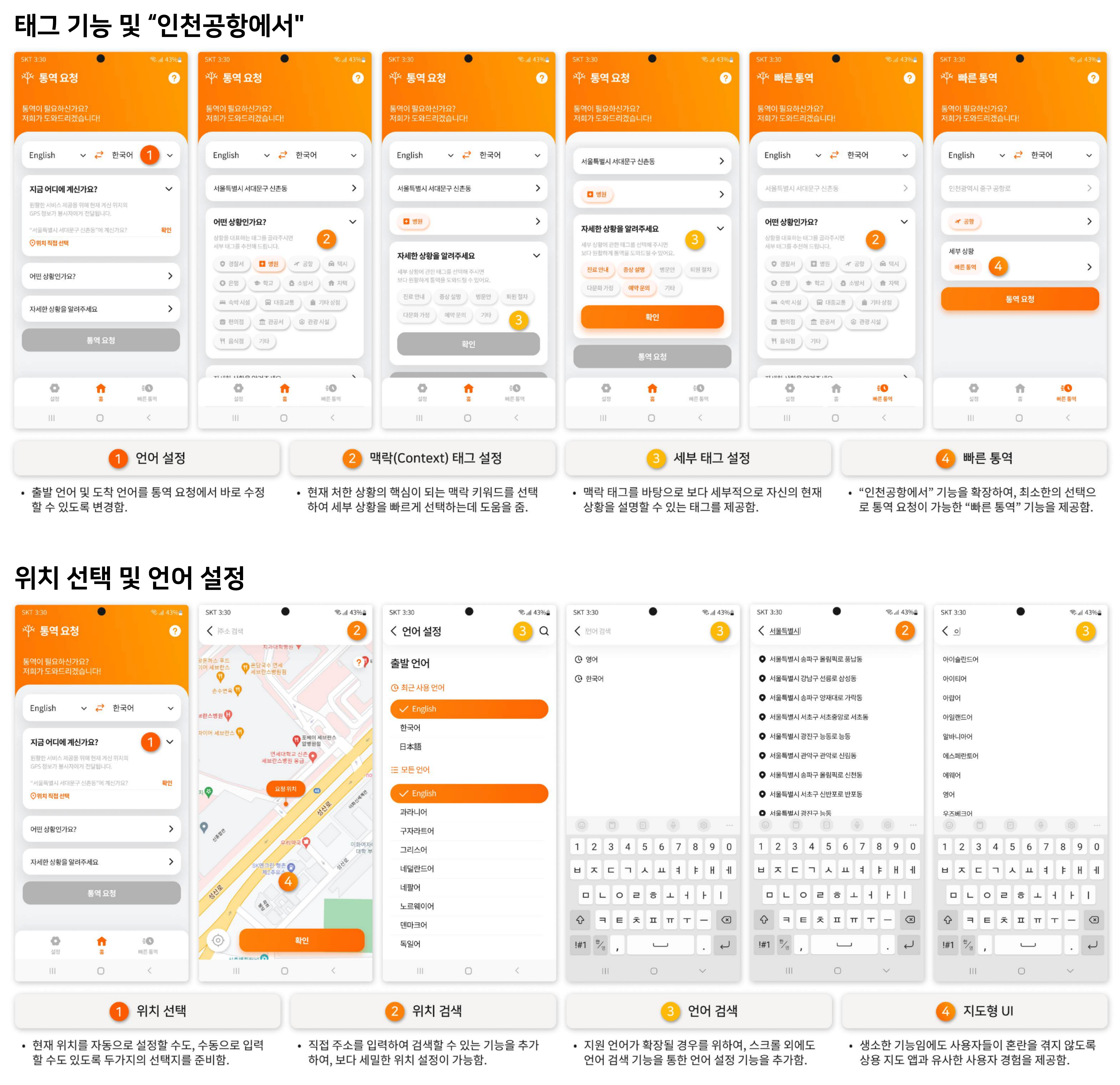 Key user app screens: language settings, location selection, context tags, detail tags, and Quick Interpretation.
Volunteer App
The volunteer app connects status management, interpretation calls, activity records, and shared experiences in a clearer flow.
Managing Availability
Volunteers need to check and adjust their status regularly, whether they are on standby, interpreting, or temporarily away. We brought the main settings onto the home screen and simplified the controls for changing status.
Frequently used settings, “Priority Volunteering” and “Temporarily Unavailable,” can be changed with a single tap. “Unavailable” and “Paused,” which need more detailed time settings, have separate settings screens. We also used on/off toggles for selected features and bottom navigation to simplify movement between menus.
Interacting During Calls
We changed the call controls from a 1×5 grid to a 2×3 grid, making the icons larger and helping prevent accidental taps. Image sharing and text chat give callers and volunteers additional ways to communicate during a call.
Recording and Sharing Volunteer Experiences
We also wanted the experience after a call to continue naturally within the app.
Review writing, previously accessed through external links, was brought into the app. Tags let volunteers record an experience with less explanation.
For “Volunteer Stories,” we proposed a post-based format with comments and likes, encouraging volunteers to share experiences and respond to one another.
The aim was to create a flow from volunteering to keeping a record and taking part in the community.
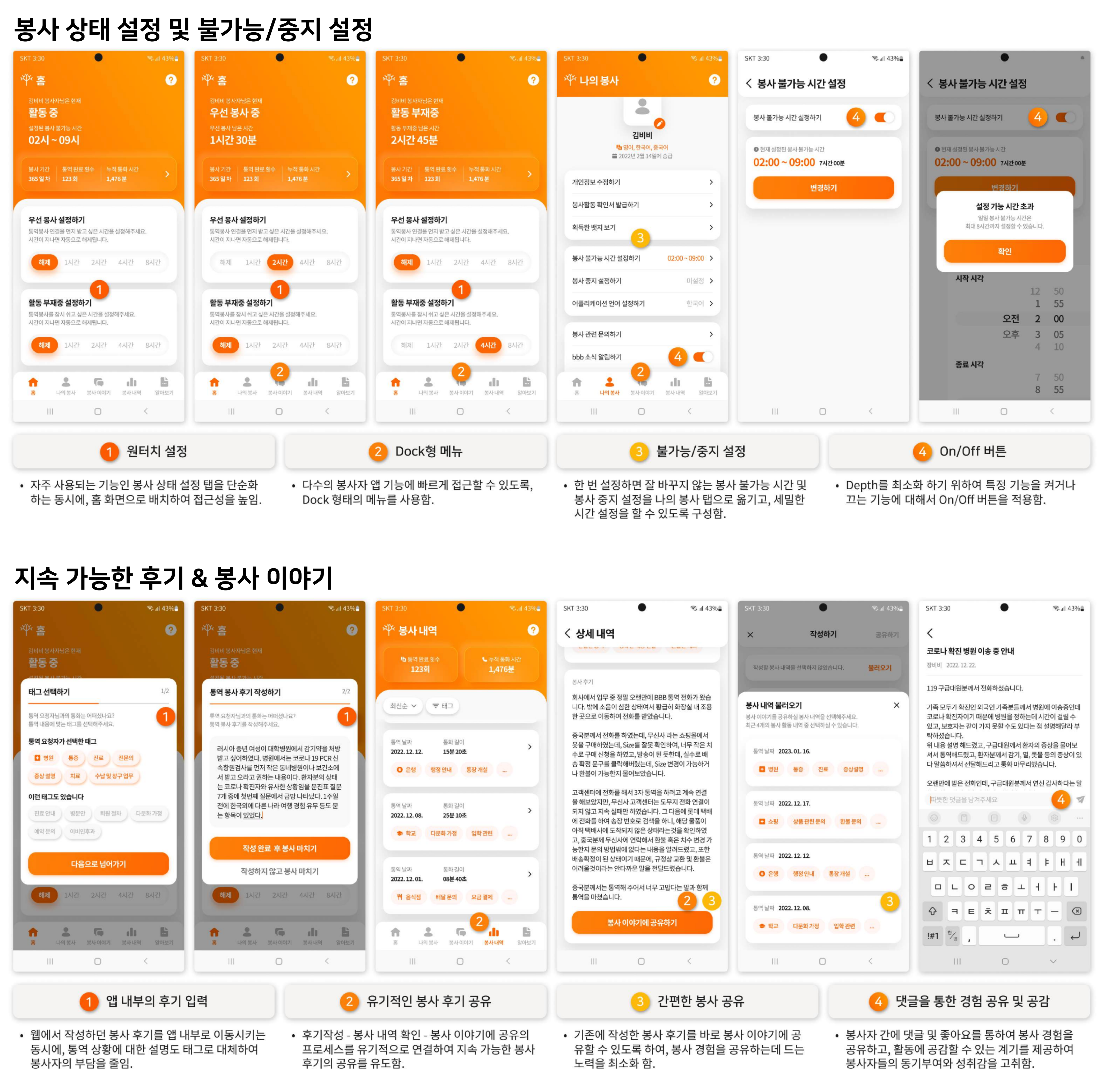 Volunteer app screens: status and availability settings, in-app reviews, and Volunteer Stories.
Help and Onboarding
New features could take some getting used to for both existing and new users. We placed a help button at the top of each page to provide step-by-step guidance.
Highlights and speech-bubble popups explain relevant areas, helping users find the information they need within the screen they are using.
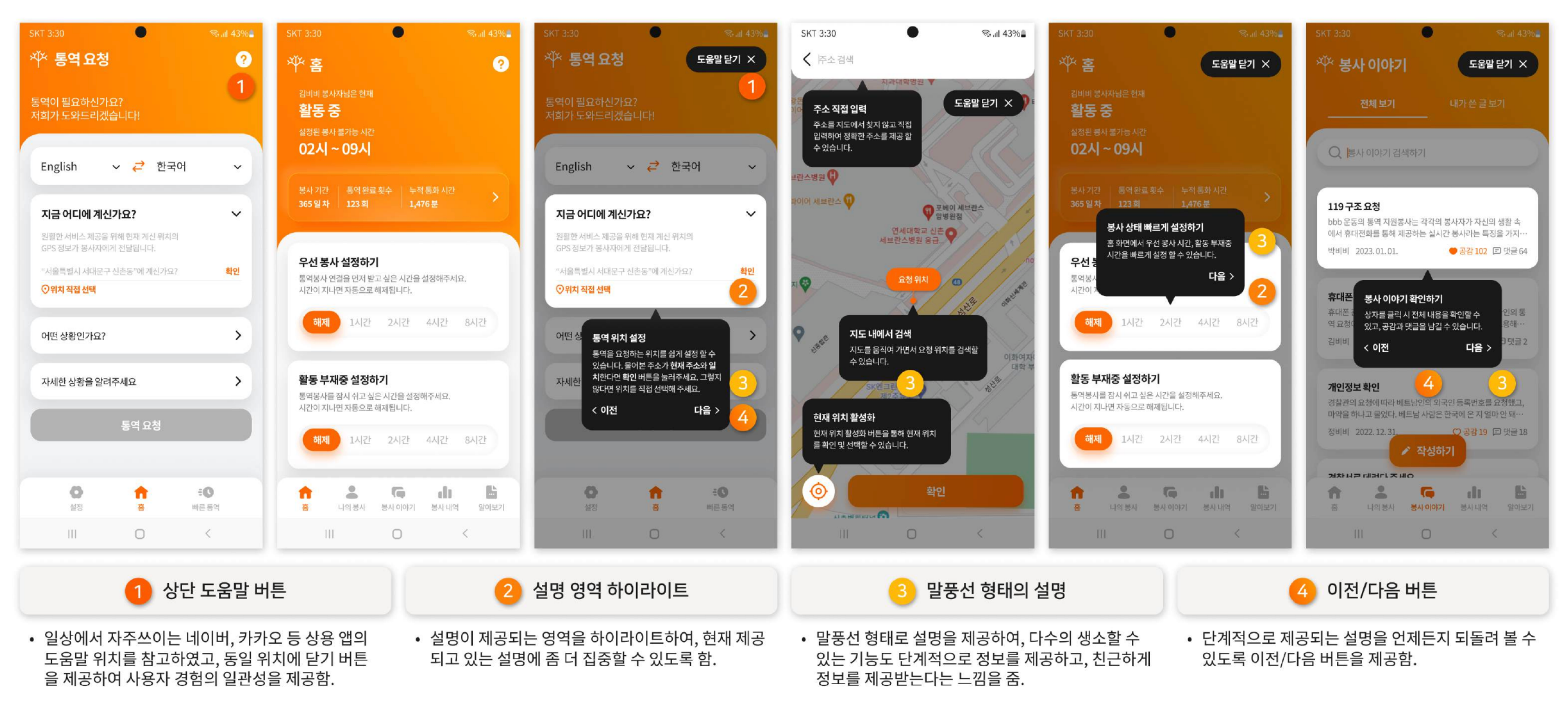 Help and onboarding screens that guide users through key features step by step.
5 Reflection
- Designing for a specialized service starts with understanding what people need to do. Telephone interpreting is not a service most people encounter every day. I found it useful to look for shared tasks and interaction patterns in other services, rather than searching only for similar apps.
- Platform conventions shape what users expect. Working on the iOS volunteer app let me apply platform guidelines to real screens and see the differences in detail: back navigation, tab placement, and button-label capitalization. I learned to maintain a consistent brand experience across iOS and Android while respecting the habits users bring from each operating system.